Our Featured Collection
Hand‑picked premium works for you
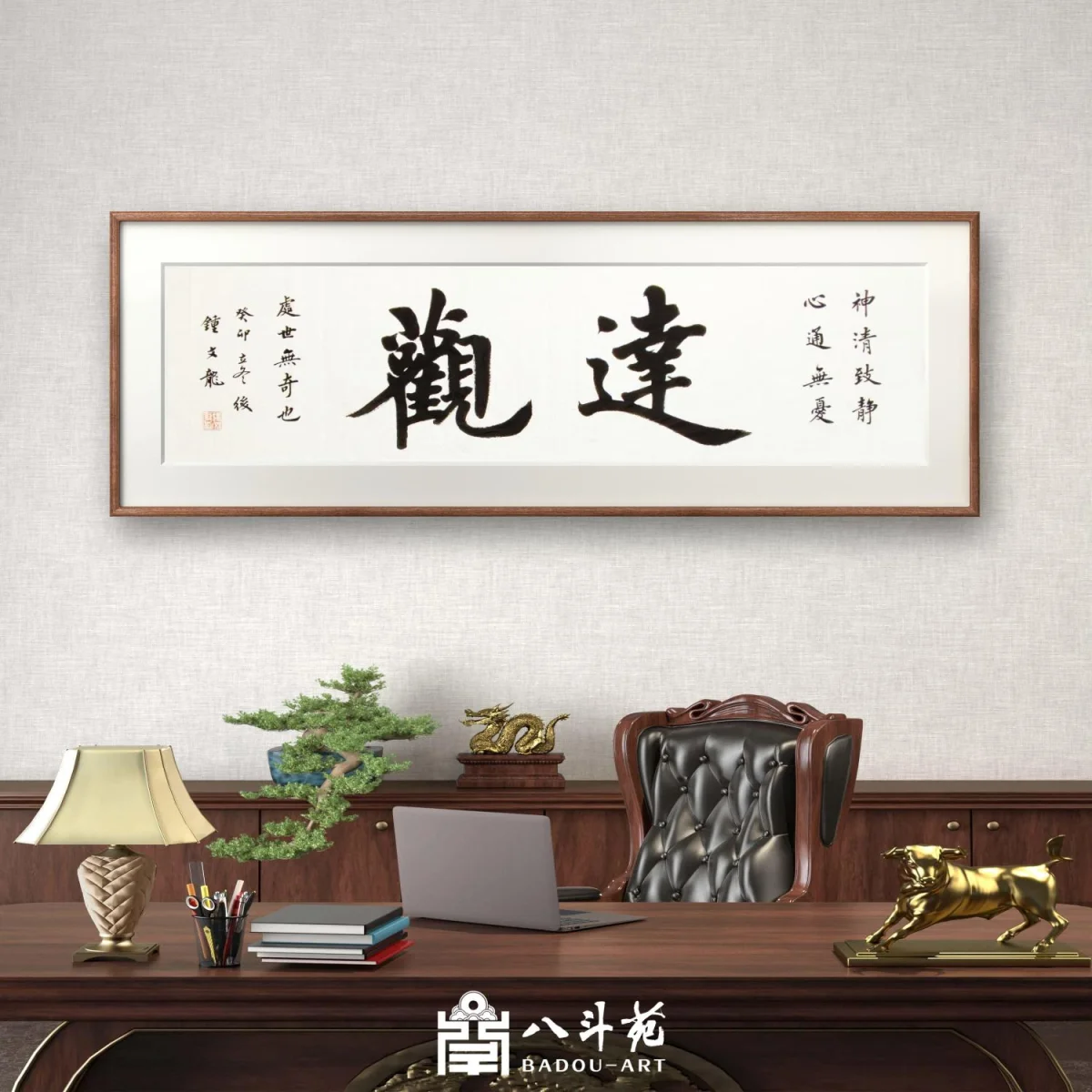
Zhong Wenlong Calligraphy | 达观
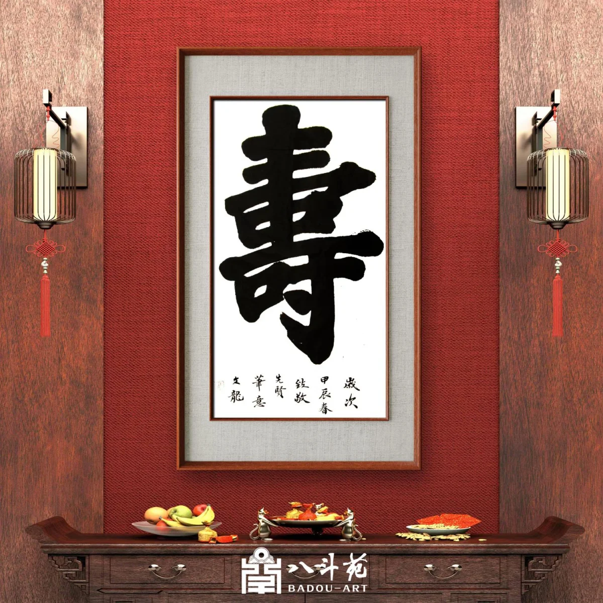
Zhong Wenlong Calligraphy | 壽
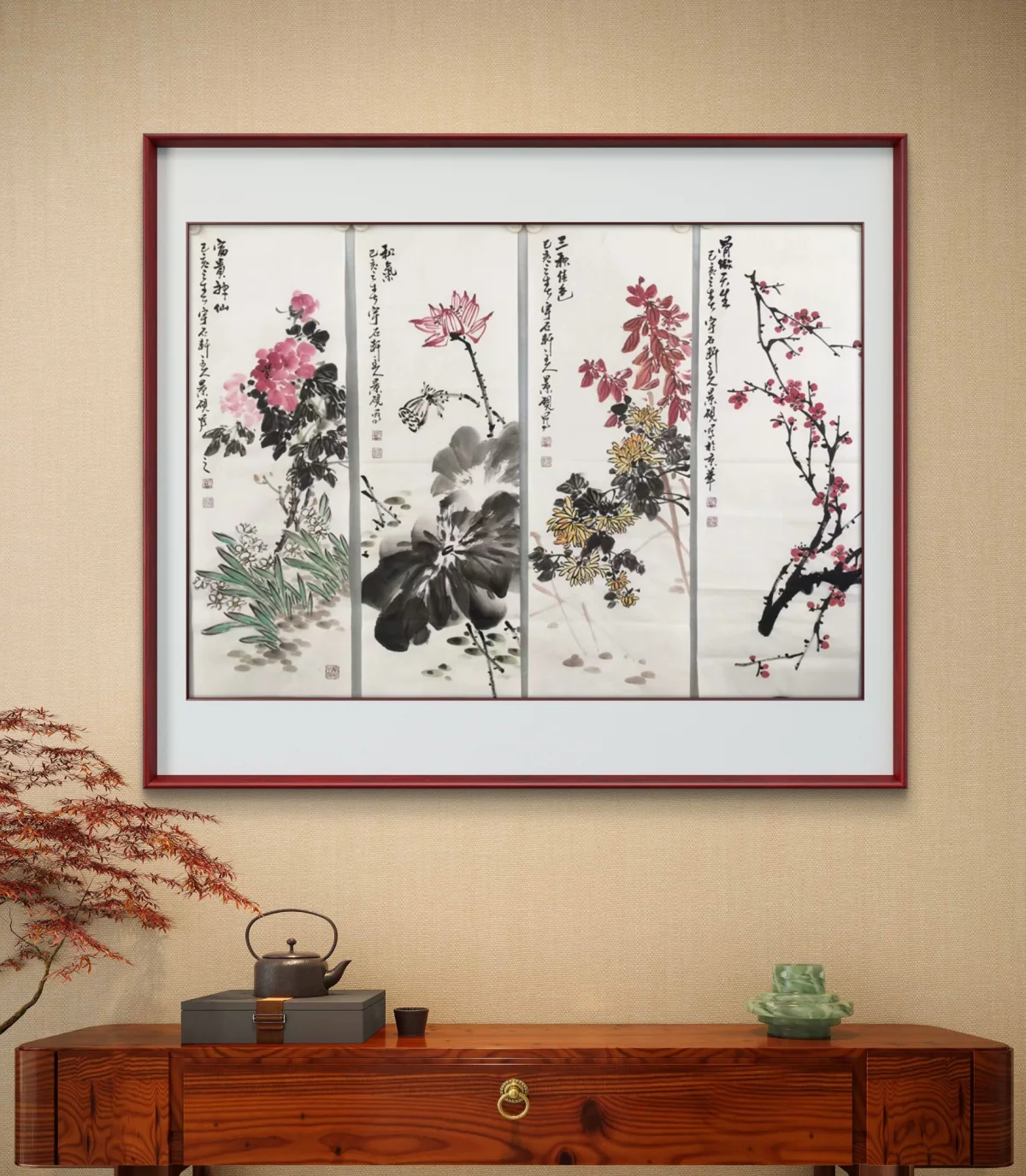
Wu Jingyan Chinese Freehand Painting・Four‑Panel Flower‑and‑Bird Screens(花鸟四条屏)
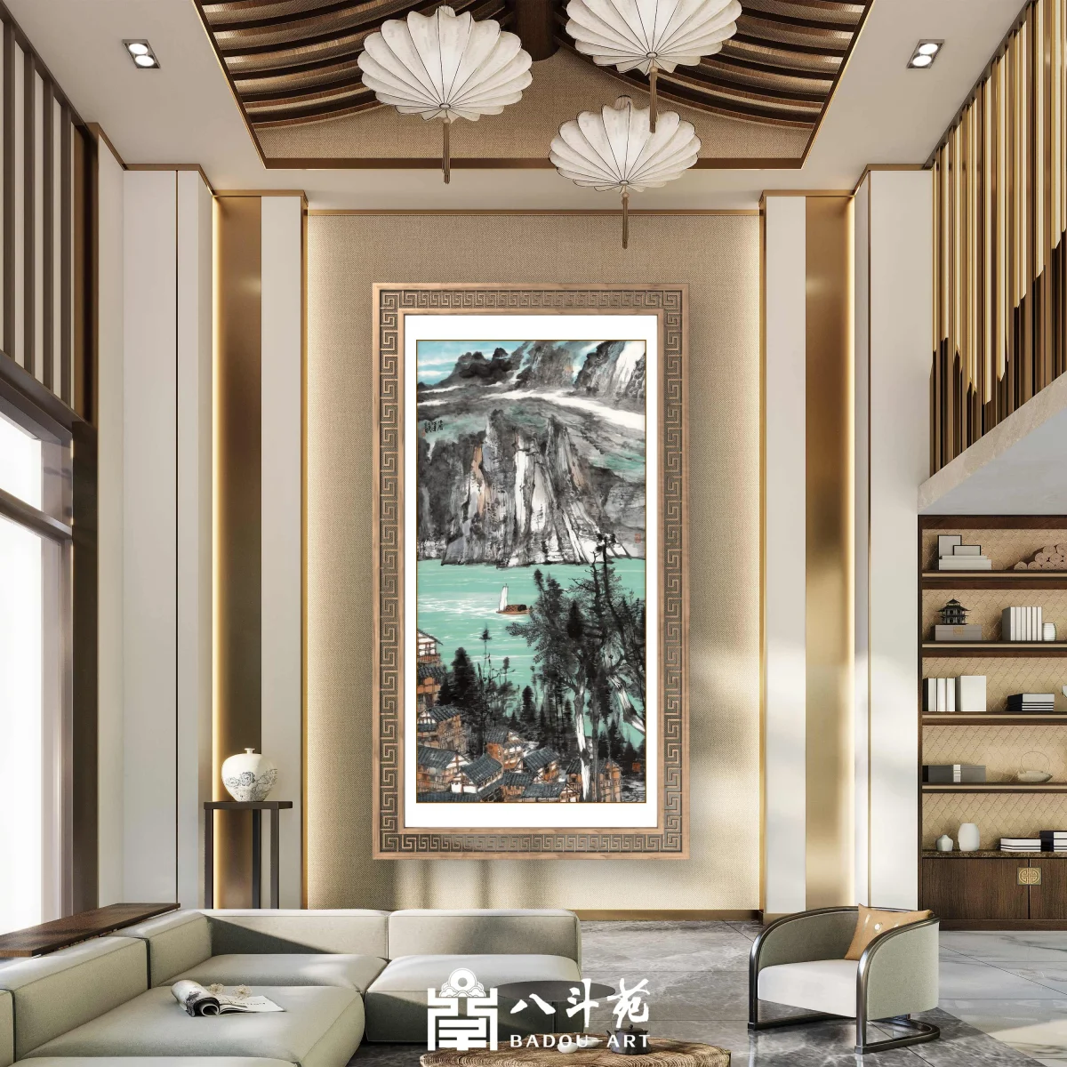
Liu Liyong Landscape Painting | Riverside Mountain Hamlet (山居江远)
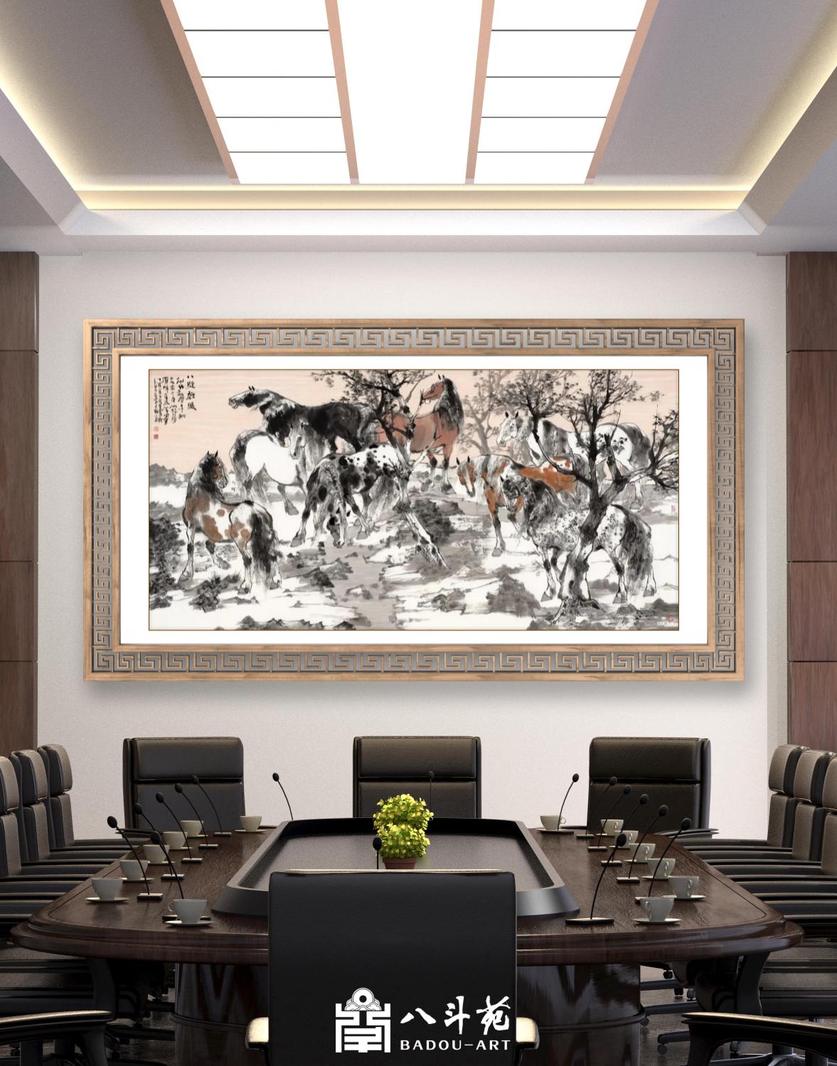
Liu Liyong Animal Painting | Eight Steeds (八骏图)
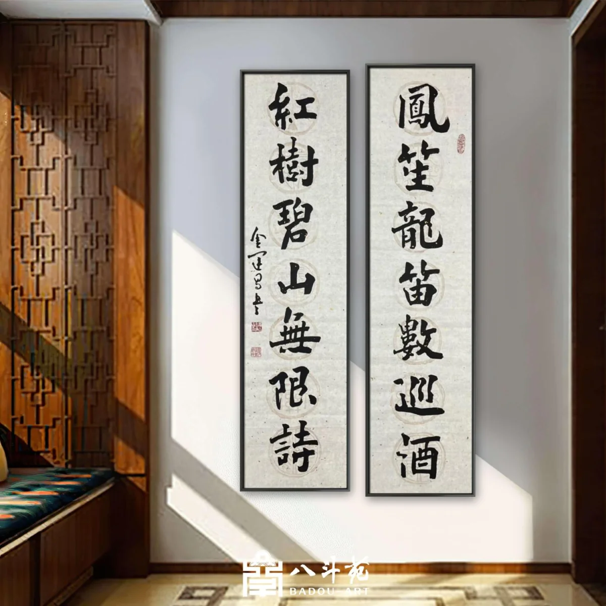
Jin Yunchang Calligraphy | 鳳笙龍笛數巡酒
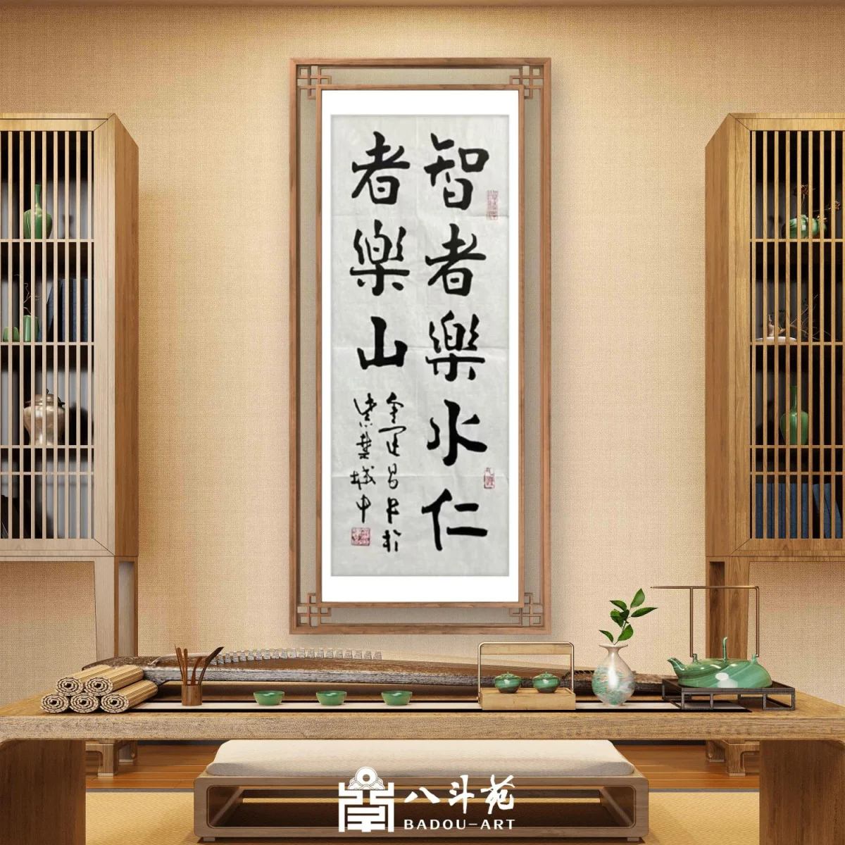
Jin Yunchang Calligraphy | 智者樂水仁者樂山
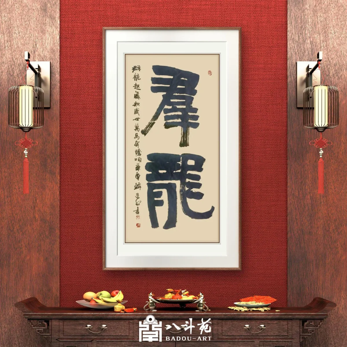
Han Jinshui Calligraphy | 羣龍 (A Group of Dragons)
Choosing Calligraphy Fonts for Ads, Logos, and Posters
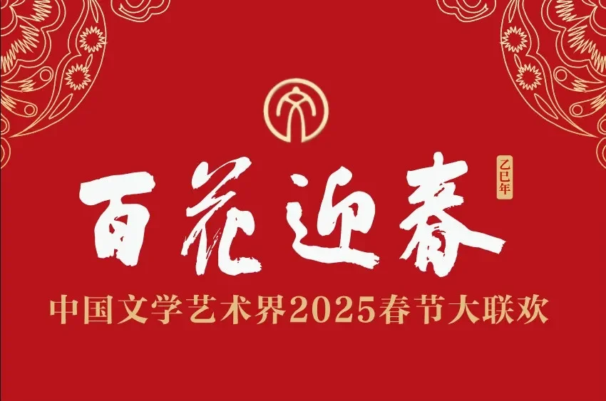
Choosing Calligraphy Fonts for Ads, Logos, and Posters
A calligraphy font can give a brand instant distinction — but the wrong choice can quietly undermine a campaign. From advertising slogans and film titles to corporate culture walls, Chinese brands increasingly turn to handwritten calligraphy. Drawing on years of commissioned plaque and inscription practice, here is how to choose the right style for each use.
Why Calligraphy Fonts Work
Calligraphy brings five concrete benefits to promotion and branding:
- **Distinct identity.** A handwritten style carries artistic character and historical depth that no standard typeface can match.
- **Stronger recognition.** A calligraphic logo or slogan is easier to remember and stands out from competitors.
- **Visual appeal.** Artistic lettering adds impact and creativity to posters, packaging, and brochures.
- **Heritage.** The brush communicates tradition and values, building trust and goodwill with the audience.
- **Versatility.** Calligraphy adapts across industries — energetic and progressive for sports, elegant and innovative for food and automobiles.
Plaques, Signs, Brand Names, and Logos
For a company plaque, storefront sign, brand name, or logo, choose dignified, stable scripts: regular script in the Yan Zhenqing or Liu Gongquan manner, Northern Wei stele style, ancient or Han clerical script, seal script, or running script. Avoid cursive — its speed and abbreviation can hurt legibility and authority.
For group companies and brands built to last a century, the strongest move is to commission a celebrated contemporary calligrapher. A master’s hand-carried work carries deeper cultural weight and becomes part of the brand’s story.
Slogans, Posters, and Subtitles
For advertising slogans, posters, and screen subtitles, prefer clean, standard styles: Liu-style regular script, Ouyang Xun’s regular script, clerical script, Northern Wei style, Chu Suiliang’s manner, or running script. Use recognized calligraphy fonts or work with professional calligraphers — especially for official institutions, official media, and formal occasions. Avoid “folk” creative fonts and ungrounded “jianghu” styles; they can harm a serious message or even backfire on the brand.
Decorative and Cultural Settings
For decorative calligraphy, art pieces, and cultural backdrops, all five scripts — seal, clerical, regular, running, and cursive — are open. The choice depends on the content and the environment: seal and clerical for gravitas, running script for warmth, cursive for drama. Commissioning an artist to write specifically for the space ensures the work fits both the message and the wall.
A Practical Tip
Before choosing, ask two questions: Who is the audience, and what is the occasion? A formal government ceremony calls for solemn regular script; a creative product launch may welcome the energy of running script. When in doubt, simplicity and tradition rarely fail — and a professional calligrapher can advise on the exact style, size, and format for your project.
If you’re considering a commissioned inscription, plaque, or logo work, Badou Art’s specialists are happy to guide you.